


奶酪藍月亮
創新策略:
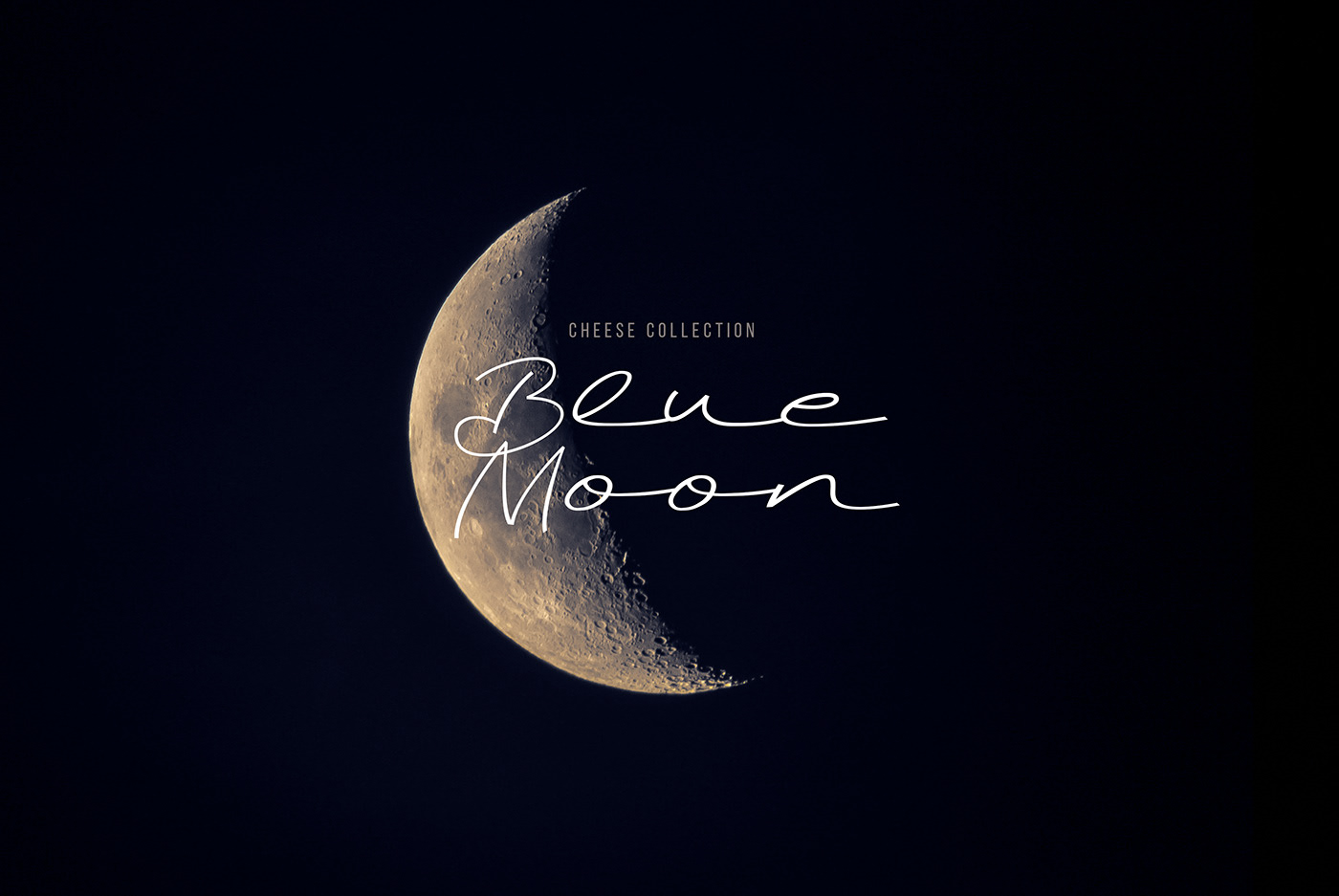
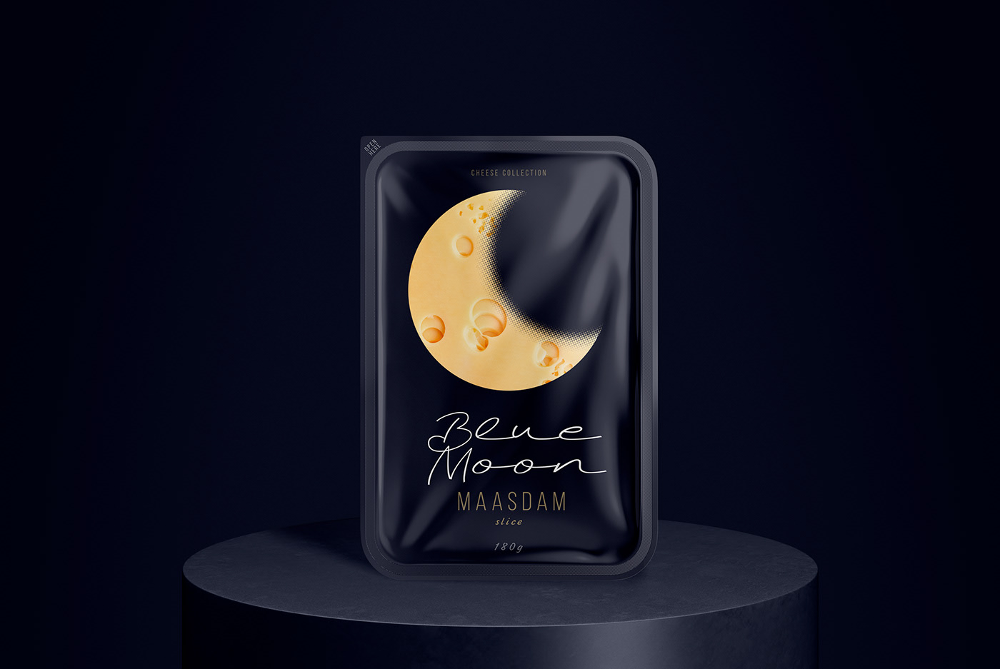
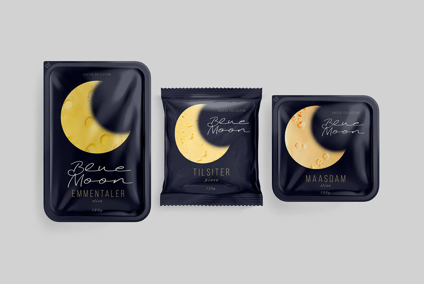
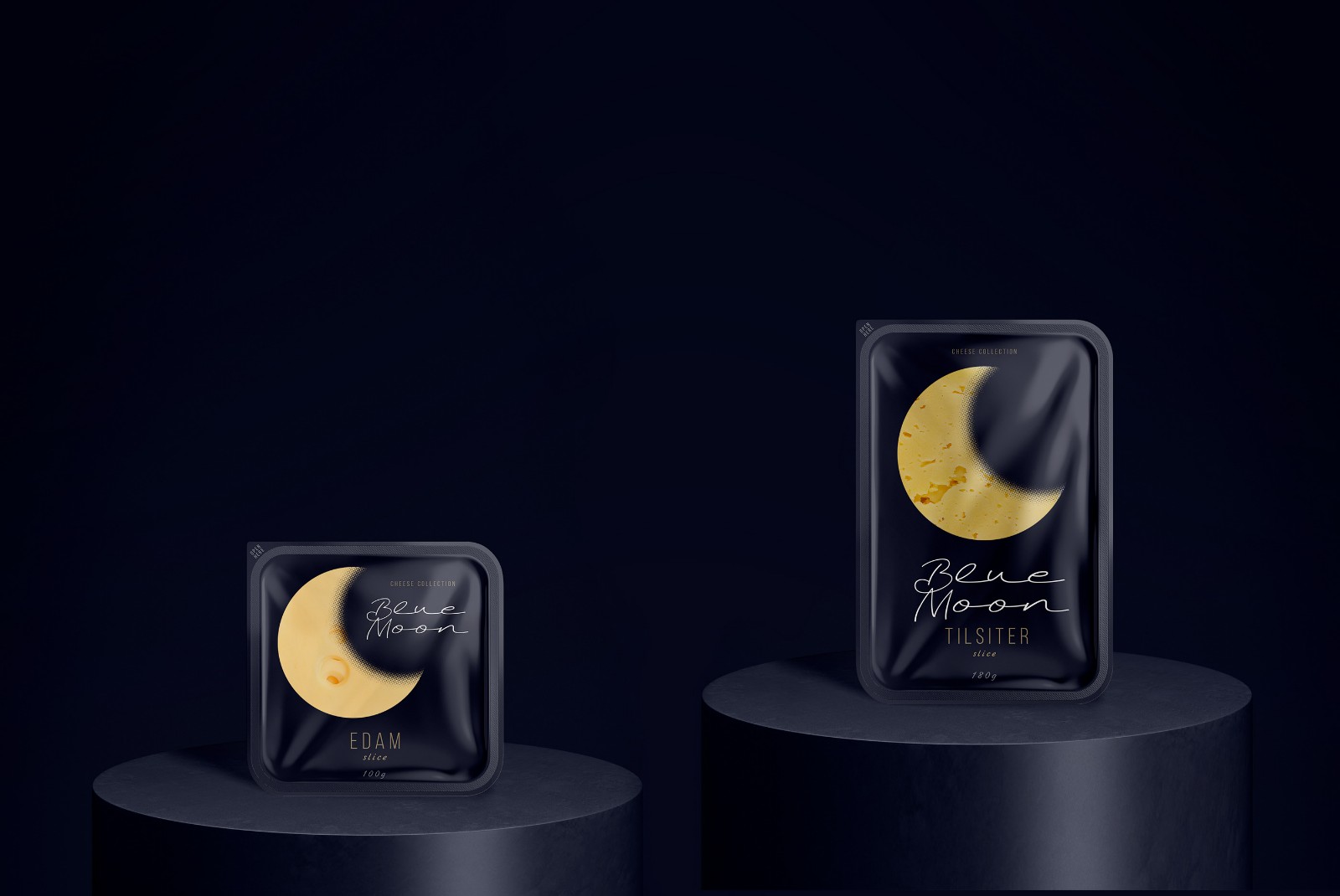
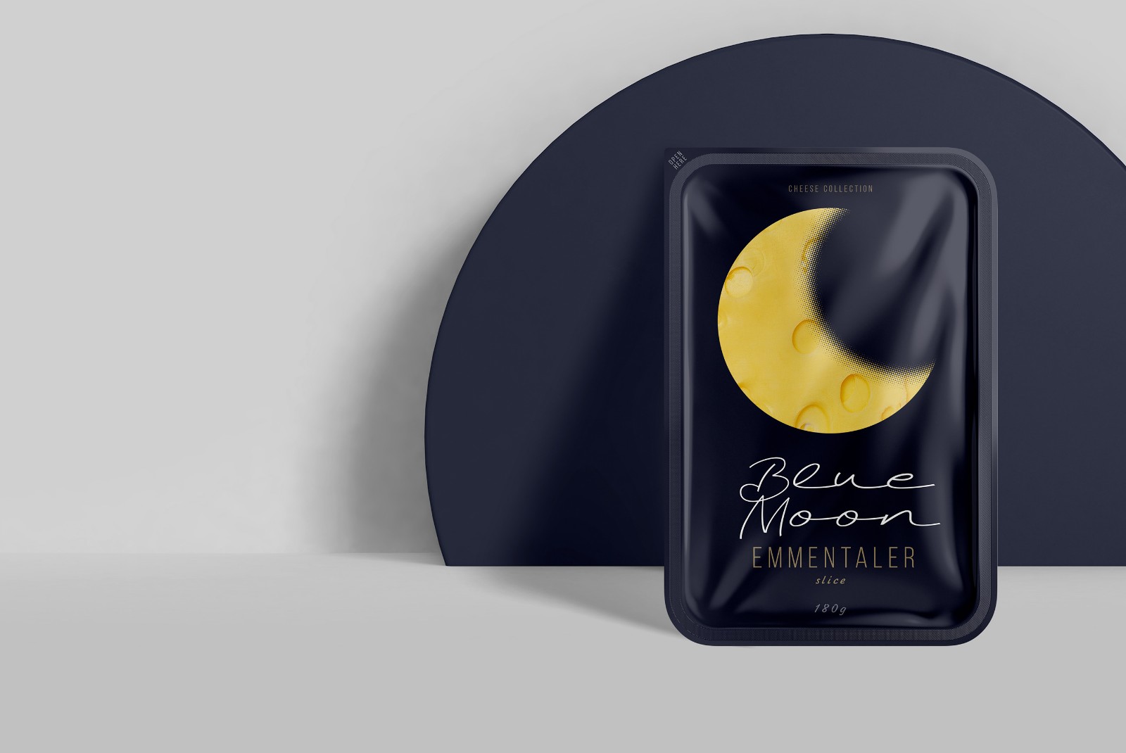
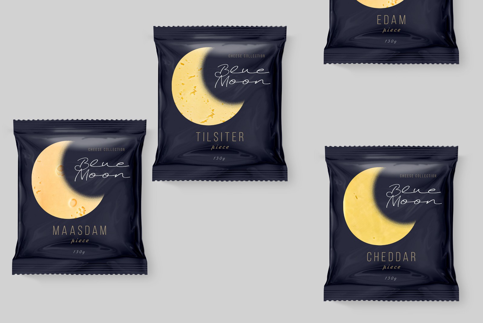
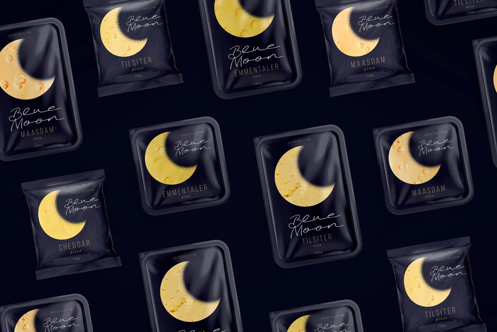
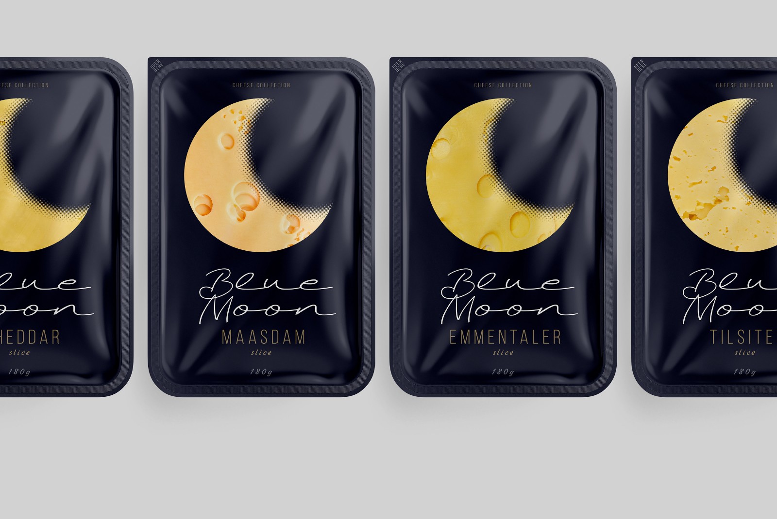
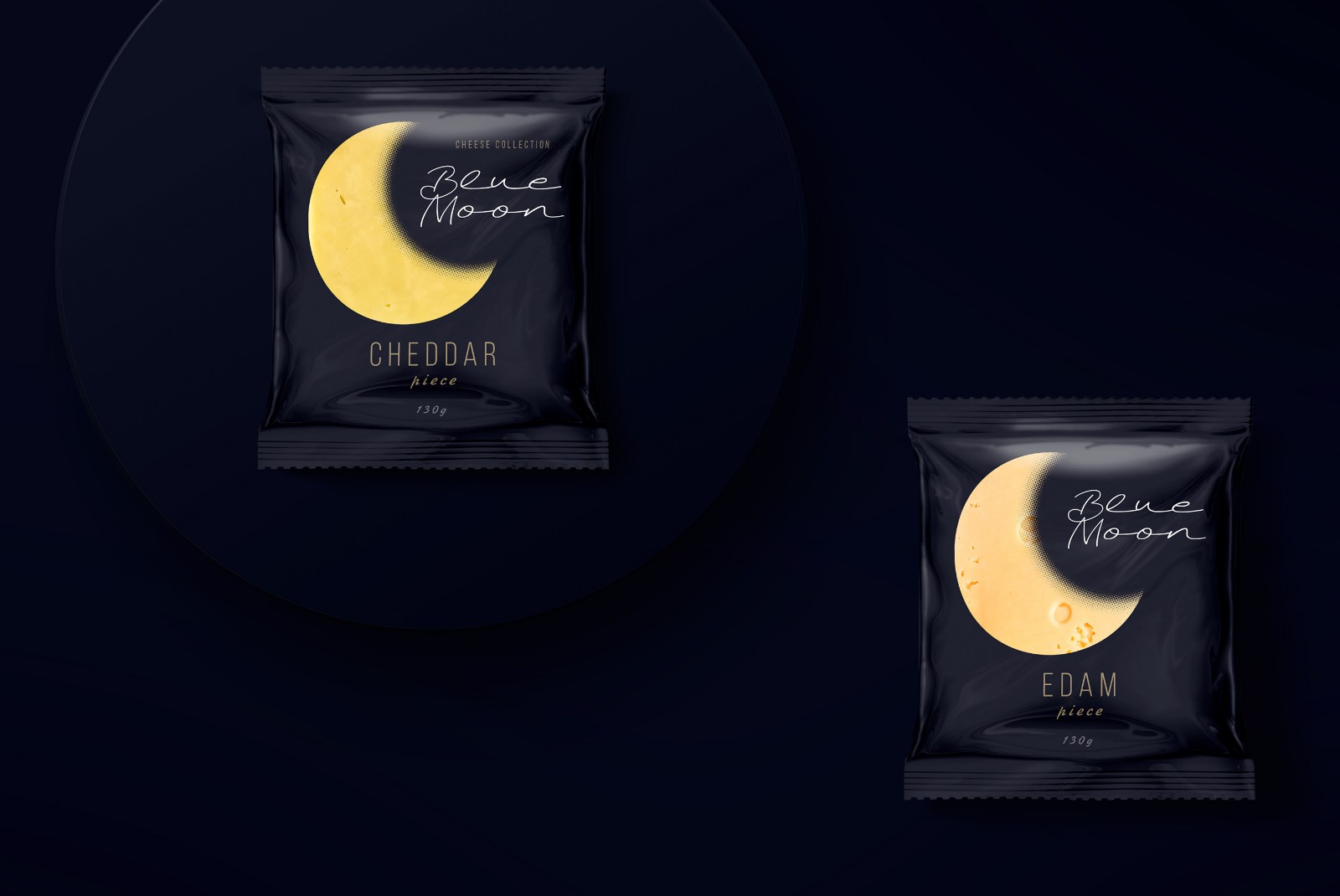
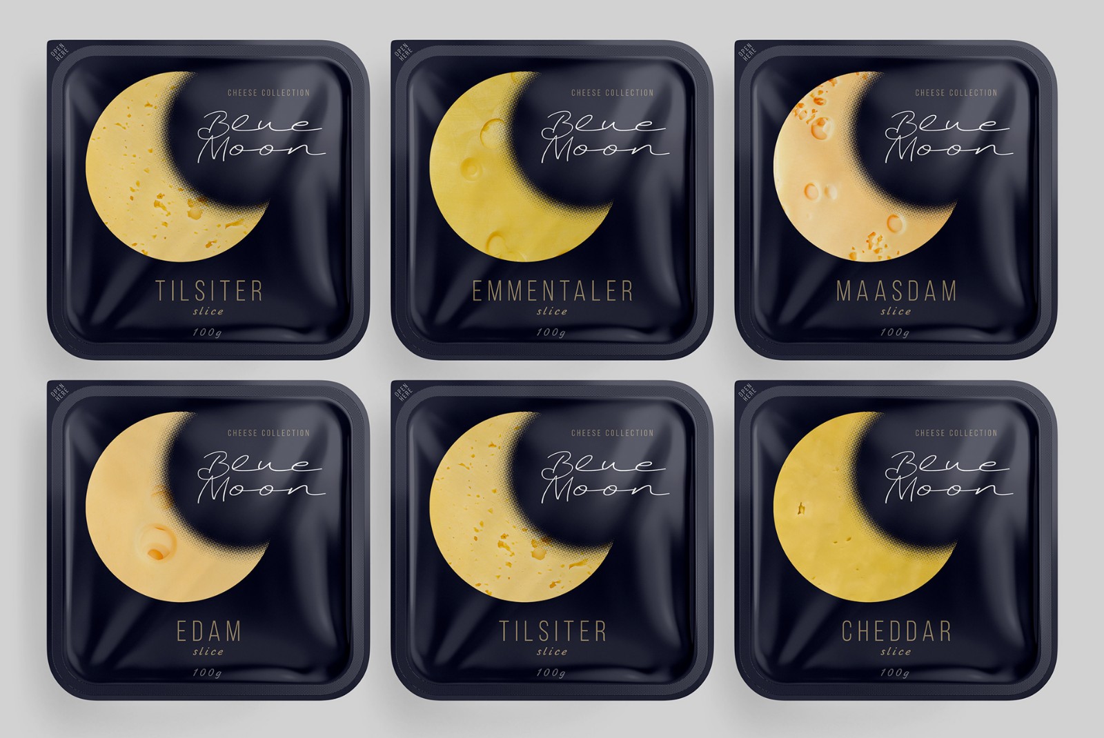
在開發奶酪系列的設計時,我們想強調特定的產品優勢。憑借其成分,藍月亮清淡奶酪非常適合作為快速的宵夜小吃,而又不影響身材和飲食習慣。主要元素是月份,是一天中時間的象征,同時也是可識別的可視圖像比較。天體的黃色和火山口長期以來一直是流行文化中奶酪的幽默隱喻。延續月球的想法,我們選擇了深夜藍色。除了“暮光之城”的語義名稱外,它還創建了一個簡單的,簡潔的背景,在這個背景下,公司元素-就像一塊奶酪一樣-月份清晰可見,并且易于閱讀。

Idea:
When developing the design for the line of cheeses, we wanted to highlight a specific product advantage. Thanks to their composition, Blue Moon light cheeses are perfect for a quick evening snack, without consequences for the figure and diet. The main element was the month, as a symbol of the time of day and at the same time a recognizable visual image-comparison. The yellow color and craters of a celestial object have long been a humorous metaphor for cheese in popular culture. Continuing the idea of ??the moon, we chose a deep night blue. In addition to the semantic designation of twilight, it creates a simple, laconic background against which the corporate element - the month, like a slice of cheese - stands out clearly and is easily read.
Copyright By SEALINGAD 2005-2023 All Rights Reserved. 京ICP備11038889號-2 京公網安備11010502007731號
西林設計案例均為西林設計原創, 版權歸北京西林品牌產品包裝設計公司所有,侵權必究。